


KIOSK - Identidad Hostal Espiritual
Based on an initial project of a 3D infographic illustrated in isometric perspective, I developed
the brand identity of my mother's dream, a spiritual hostel on a paradisiacal beach in Palomino, Colombia. Including, the logo and its abbreviation, color palette, patterns and graphic elements
such as; welcome diptych, business cards, map of the place, website and main Instagram page.


1. Sector Analysis
Taking into account the character of the project, I have created a conceptual map that covers the sector for
which I will design, tourism, but compiling the values and concepts of the briefing. The graphic materials and
final design should highlight these concepts, but they should also be reflected throughout the creation process.

2. Market Analysis
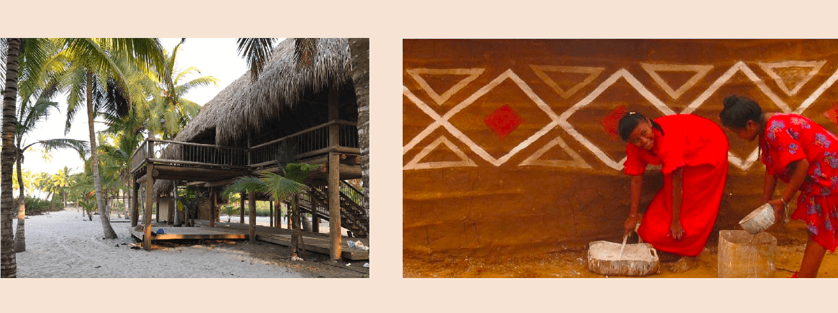
Taking a look at similar brands in the market, I understood the importance of the use of complex but clean logos that stand out, because the market is very big and each brand wants to stand out, and hostels normally remit to more personal attendance than a hotel (which is more luxurious). The identity of MUTIG Hostal created by Juan Roa, shows the process of assembling both a yoga pose and the synthesis of a indigenous pattern into the logo and brand disposition. This idea reflects what I want to present in the identity for this project.

3. Inspiration
Name: KIOSK ecolodge: Kiosk/Cabin, because the inspiration parts of the structure that already exists.
Logo Idea: The logo uses the K's in the name to form a figure (something similar to a kiosk), which also resembles the patterns of the Wayuu indigenous people of the area. I am interested in using the pattern
Wayuu, in bright and “natural” colors, to unify the structure, community, spiritual culture and nature.
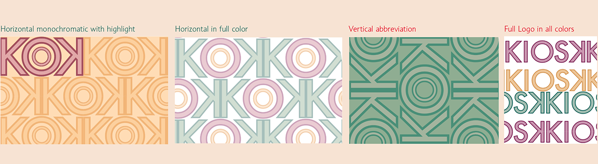
4. Logo Design
I started my creation process testing the name with different fonts, I quickly realized that the final K would be better if this would be reflected, because it encloses the name inside a “structure” similar to that of a cabin and gives it a symmetrical look. A geometric font definitely worked better so I filled each letter with a color and the outline with a darker tone. For a sorter version of the logo (used in different adaptations), the abbreviation gives the impression of being an image of a eye (of spirituality) or a symbol that can be used as a pattern.

5. Color Palette
The color palette chosen is in earthy tones, which resemble peace, spirituality, woman and nature. Which gives the possibility of having nice combinations in material design. As secondary color I have included a pastel blue, that pairs up very well and represents the bodies of water that surround the hostel.

6. Patterns
After creating some patterns with the logo and the abbreviation vertically and horizontal, I have decided
that horizontal patterns with a variation of 1/2 are the ones that look best. The vertical patters lose the basis
of the abbreviation of the logo and the pattern with the Logo in different colors does not resemble the original inspiration of the Wayuu patterns.
7. Typography
The logo is accompanied by a tagline using a typography complementary to the Futura, the Souvenir font, a serif with a lot of personality, but still kind of geometric. I have decided to implement it as italics to give movement to the identity, representing what would be tourism and the nomadic community. Contrary to the logo, the Souvenir font is for primary texts and titles, because of its expressiveness, and Futura for web and body paragraphs, as it is more legible.


